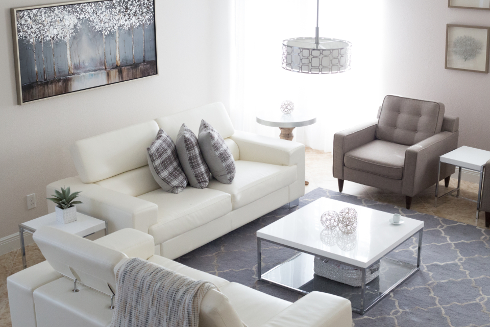

The Rise and Reign of “Millennial Gray”
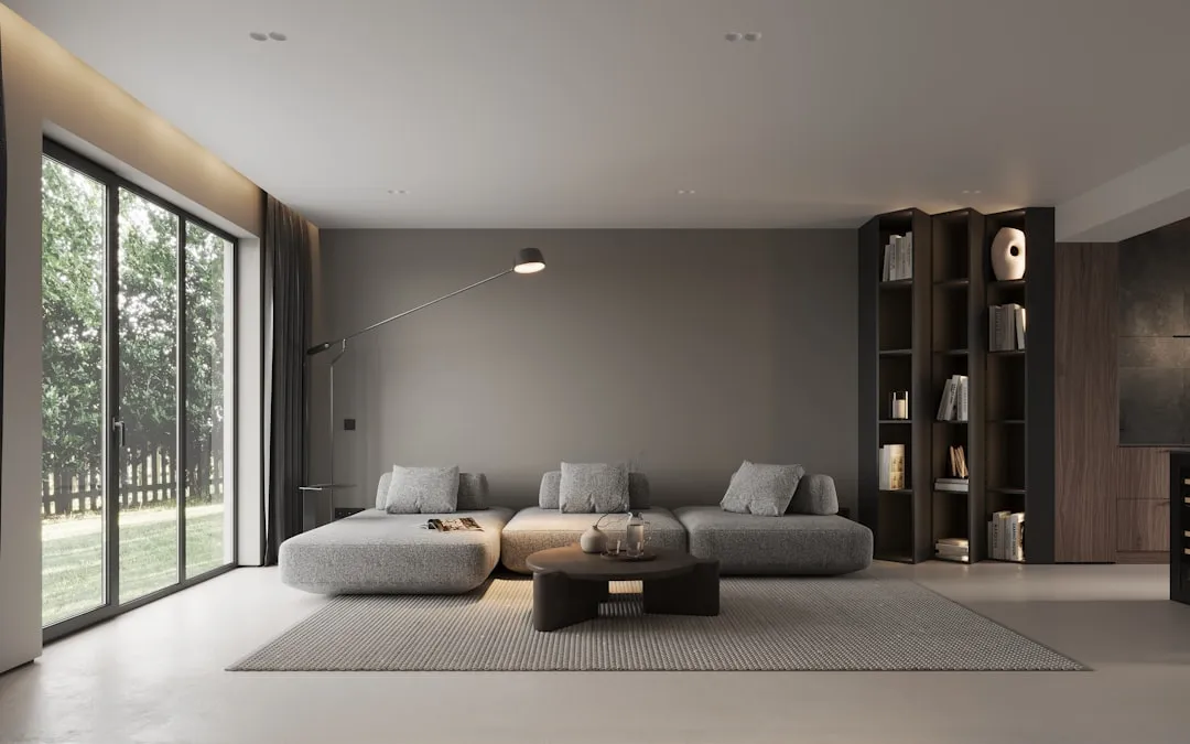
For well over a decade, gray ruled interior design, and it made a certain kind of sense. When minimalism swept into mainstream homes around the early 2010s, gray offered something distinctive: it was sleek without being stark, neutral without being boring, and effortlessly modern.
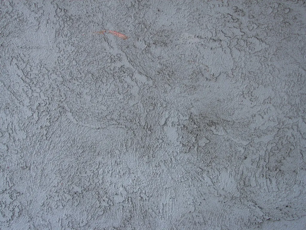
From millennial gray, which introduced cool grays, charcoals and crisp whites to homes, to the rise of greige that mixed gray with beige, the evolution of gray dominated neutral color conversations for years. It became the default answer to nearly every paint question, in every room, in every price range.
For quite some time, cool gray was everywhere. People filled their homes with gray. It felt safe, contemporary, and endlessly compatible with almost any furniture. That broad appeal, it turns out, was also its eventual downfall.
Why Designers Are Now Walking Away
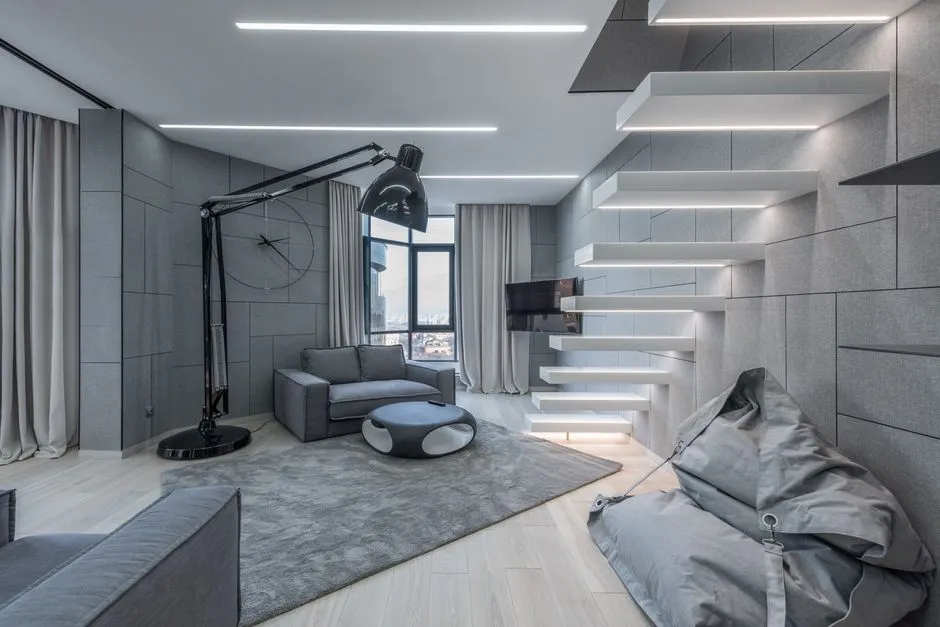
Interior designer Lauren Saab puts it plainly: cool gray is starting to feel dated. For years, it was the go-to choice for everything from walls to kitchen cabinets, but many of those icy gray tones now feel flat and impersonal. A lot of homeowners chose gray because it felt like the safe option, and the downside is that safe often ends up looking sterile.
While gray was popular in the early 2000s, valued for its versatility and fresh, contemporary feel, the shade has undeniably fallen out of favor over the last decade. Today, it often receives a cool reception from interior designers, who avoid it for fear of it feeling too cold, drab, or overused.
Gray is still seen in many parts of the world, and color consultants still receive requests for it. However, where three years ago roughly eight out of ten consults were on gray paint colors, that figure has now dropped to about one out of ten, which speaks volumes about the momentum of this shift.
The Psychology Behind the Pushback
A growing body of neuroscientific, behavioral and psychological research shows that color is not merely a matter of taste. The hues that surround us influence our emotional states, cognitive performance, social interactions, sleep, and even our long-term psychological well-being.
The psychological impact of a color hinges on shade and context. Cold grays or stark whites may evoke sterility or sadness, particularly in poorly lit spaces. This is especially relevant in north-facing rooms, where cool gray walls can drain a space of energy entirely.
Gray is the most neutral of neutrals and is associated with self-restraint at times, but also sleek sophistication. It has a calming, unemotional effect and can be somewhat draining on its own, though it makes other colors stand out when used in combination. Darker shades of gray may make you feel edgier and moodier, while lighter shades feel more timeless.
The Industry Signals a Permanent Shift

Sherwin-Williams named Universal Khaki SW 6150, a warm midtone neutral, as its 2026 Color of the Year. Benjamin Moore named Silhouette AF-655, a deep espresso brown. Both announcements, made within weeks of each other in late 2025, pointed unmistakably in the same direction.
Pantone’s 2025 Color of the Year, Mocha Mousse, was described by the Pantone Color Institute as a mellow brown that conjures feelings of comfort and warmth. Three Color of the Year picks in a row in the warm family, across two years and three of the most-watched brands in the industry, is not a coincidence. It is a marketing consensus.
The two largest paint brands in the United States both picked colors that are unmistakably not gray, and both built marketing campaigns around the language of warmth, earthiness, and “grounded” comfort. Both brands are signaling the same thing in slightly different vocabulary: warm neutrals are the next decade’s safe paint. Cool grays are the previous decade’s safe paint.
How Gray Became Culturally Outdated
Fortune covered the “Tuscan Mom” aesthetic that racked up millions of TikTok views in 2026, noting that millennials rejected the warmth and heaviness they grew up with, and Gen Z is rebounding from that because gray became the default, and defaults tend to feel boring. Gen Z is now actively associating millennial gray with their parents’ generation, which is the kiss of death for any aesthetic.
In recent years, there has been an increasing focus on how interiors feel, not just how they look, prompting an evolution in the tones people choose to surround themselves with. As a result, once-popular gray is being replaced with warmer tones that feel comforting and soothing.
As people spent more time at home, especially through the years of global disruption, they started craving color that felt alive, grounding, and deeply personal. Today, homeowners are turning to colors rooted in nature, memory, and warmth, signaling not just a design change, but a cultural one.
The Problem with Gray in Low-Light Rooms
If a home is light and bright, there is a better chance of pulling gray off. However, if a home isn’t bright or is north-facing, gray becomes a problem. Even painting main living areas this color without the right natural or interior lighting can make the space feel heavy and unwelcoming.
Cooler grays work better in sunlit rooms, while warmer grays keep dim areas from feeling cold. That distinction matters considerably, and many homeowners who painted north-facing rooms in cool gray now find them genuinely uncomfortable to spend time in.
Whether it be walls or cabinets, cool colors can feel sterile and unwelcoming. Warm paint colors are much more inviting. That basic emotional contrast is at the heart of why so many professionals are now steering conversations firmly away from the cool gray palette.
What Muted Sage Green Shares with Gray’s Fate
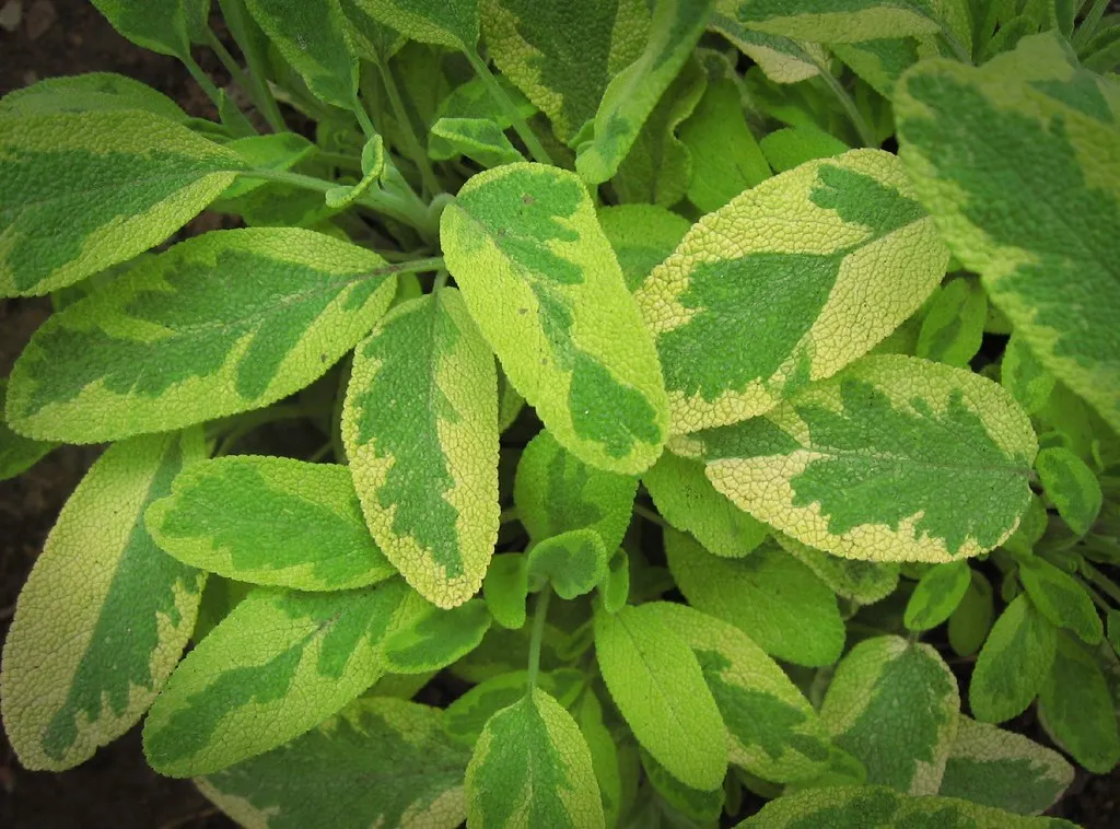
One of the colors beginning to feel less relevant in 2026 is the very muted, grayed-off sage greens that dominated interiors over the last few years, according to Tash Bradley, Director of Interior Design at Lick.
For a while, those soft sage tones answered exactly what people needed. Post-pandemic, there was this collective craving for calm, safety, and stillness within the home, and those cooler blue-gray greens delivered that beautifully. They felt soft, easy to live with and incredibly non-threatening.
Color trends are always emotional reflections of where we are culturally, and what came through strongly at Milan Design Week was a real shift away from restrained, desaturated color palettes and towards colors with far more vitality, warmth and personality. Gray-washed greens appear to be following their cooler cousin right out the door.
What Designers Are Reaching for Instead
Fueled by a desire to create calming, grounding, and sustainable spaces, steely cool grays are generally being replaced with warmer neutrals such as beige, greige, taupe, and putty shades, experts say. These colors don’t feel like a dramatic departure, but they register emotionally as something very different.
Green-leaning beiges, soft greiges, putty tones, and creamy whites are all gaining momentum as homeowners look for colors that bring warmth and softness. These shades offer the versatility people love about gray, but with a softer, more inviting, and natural feel, according to Emily Kantz, color marketing manager at Sherwin-Williams.
If there is one direction replacing the neutral-by-default era, it would be earthy mineral colors: soft terracottas, clay pinks, muted olive greens, and chalky blue-greens that feel connected to nature and change beautifully with the light. These tones also pair intuitively with the natural materials showing up in modern homes, from warm oak to unlacquered brass.
The Greige Compromise
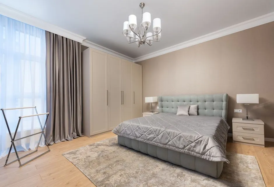
Greige is the perfect blend of gray and beige, and warm greige paint colors lean slightly toward the beige side, giving softness without losing that modern gray balance. Over the past decade, greige has quietly replaced stark gray as the go-to safe neutral. For designers who want to transition a space without making a bold leap, it’s a practical middle ground.
For 2026, a warm greige is recommended for its calming, grounding qualities. With cool grays finally on their way out, this neutral feels fresh, clean, and welcoming without any yellow or dated undertones. It works just as well in quiet, relaxed rooms as it does in spaces with a bolder character.
Gray has not disappeared entirely, but it has evolved. Cooler, steely grays are fading in popularity, while softer, warmer grays with beige or taupe undertones remain relevant. Shades that bridge the gap between gray and beige continue to perform well because they feel balanced, flexible, and easy to live with, according to Emily Kantz at Sherwin-Williams.
Should You Repaint Right Now?
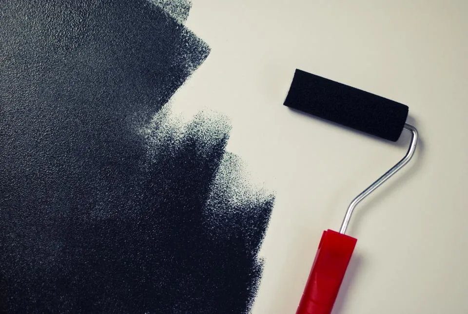
The trend being over and needing to repaint are not the same statement. Repainting a 250-square-foot living room runs around $800 to $1,200 professionally, with a whole-home repaint reaching $3,000 to $8,000 according to Angi’s 2026 cost guide. That’s not a decision to make simply because a color is no longer fashionable.
The cost-effective fix is a hierarchy: change light bulbs to 2700K, add a medium-tone walnut or oak piece, then layer terracotta or rust textiles. Paint comes last because it’s the most expensive and least reversible step. Warm accessories and lighting can shift the feel of a gray room considerably without touching a wall.
If you plan to sell in the next few years and don’t plan to repaint before listing, painting walls gray now is worth reconsidering. By the time a home is listed, the market won’t be any closer to embracing gray. Gray will make a home look dated compared to newer, trendier homes on the market. For everyone else, the decision can wait until the next natural repaint cycle.
The Bigger Picture Behind the Color Shift
Neutral tones are closely linked to a sense of calm, clarity and stability in terms of brain function. Research supports that neutrals provide a psychological anchor, a visual rest for the psyche. The difference now is that designers want that anchor to feel genuinely warm, not clinically detached.
The biggest design movement for 2026 is being described as a return to the earth in all aspects of the space, drawing on natural color palettes straight from the earth, especially the warmer, muddier hues like terra cotta, olive green, muddy brown, and earthy grays. Gray isn’t being replaced by drama; it’s being replaced by something that simply feels more human.
According to research published in the European Journal of Theoretical and Applied Sciences, modern color schemes can not only impact the aesthetic of a room but also the physical and emotional well-being of the people using it. That finding, taken seriously by the design community, is a large part of why the conversation about color has shifted from style to substance.
A Quiet Farewell to the Gray Era

AI Disclaimer: This article was created with the assistance of AI tools and reviewed by a human editor.