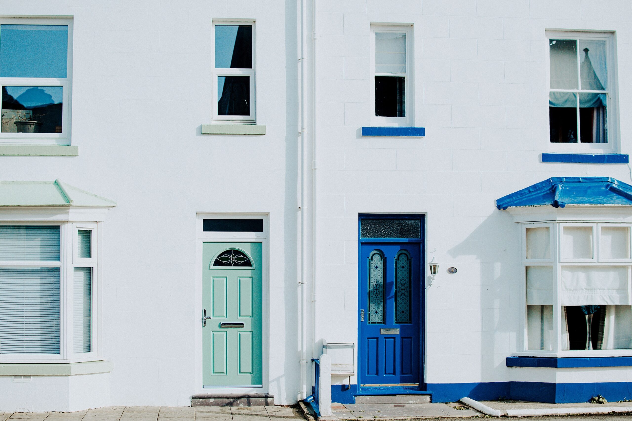

Walk down almost any residential street and you’ll notice something consistent: the front door rarely matches the rest of the house. It might be a deep navy on a pale grey home, a glossy red against cream siding, or a forest green set into a warm brick facade. This contrast feels natural, even expected. Most of us have simply accepted it without asking why.
The reasons stretch back centuries and cross continents. They involve psychology, real estate economics, cultural folklore, and a surprisingly consistent human instinct to mark the threshold between outside and inside as something meaningful.
The Door as a Focal Point, Not Just an Opening
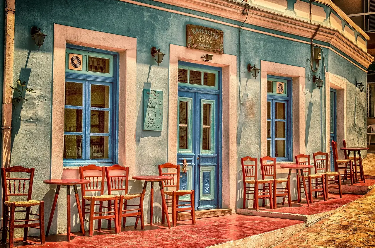
The front door acts as a focal point, drawing attention and creating an immediate impression. Architects and designers have understood this for a long time. When every surface of a home’s exterior is the same color, the eye has nowhere to land.
The front door is the focal point of a home’s curb appeal – it’s the first thing buyers see when they arrive and can set the tone for their entire impression of the property. A contrasting color solves a visual problem neatly: it tells anyone approaching exactly where to go.
As homeowners increasingly view doors as design statements rather than purely functional elements, that focal-point function has only grown stronger in the current era of home design.
Color Psychology Is Doing a Lot of Work Here
Color is known to generate emotions and relate to people’s behavior. A study called Color Psychology suggests that colors greatly “influence our moods, feelings, emotions and behaviors.” The colors that we choose for our front doors and houses can affect our moods too.
Warm colors like red, yellow, and orange can evoke warmth and positivity, while cool colors like blue, violet, and green give off a calm feeling. Homeowners aren’t just picking a color they like. They’re communicating something about who lives inside before anyone rings the bell.
Colors can evoke emotions, create atmospheres, and even influence decisions. When it comes to your entry door, the color you choose can have a significant impact on how both you and your visitors feel. That emotional function is far more powerful when the door stands apart from its surroundings.
Centuries of Cultural Tradition Behind the Choice
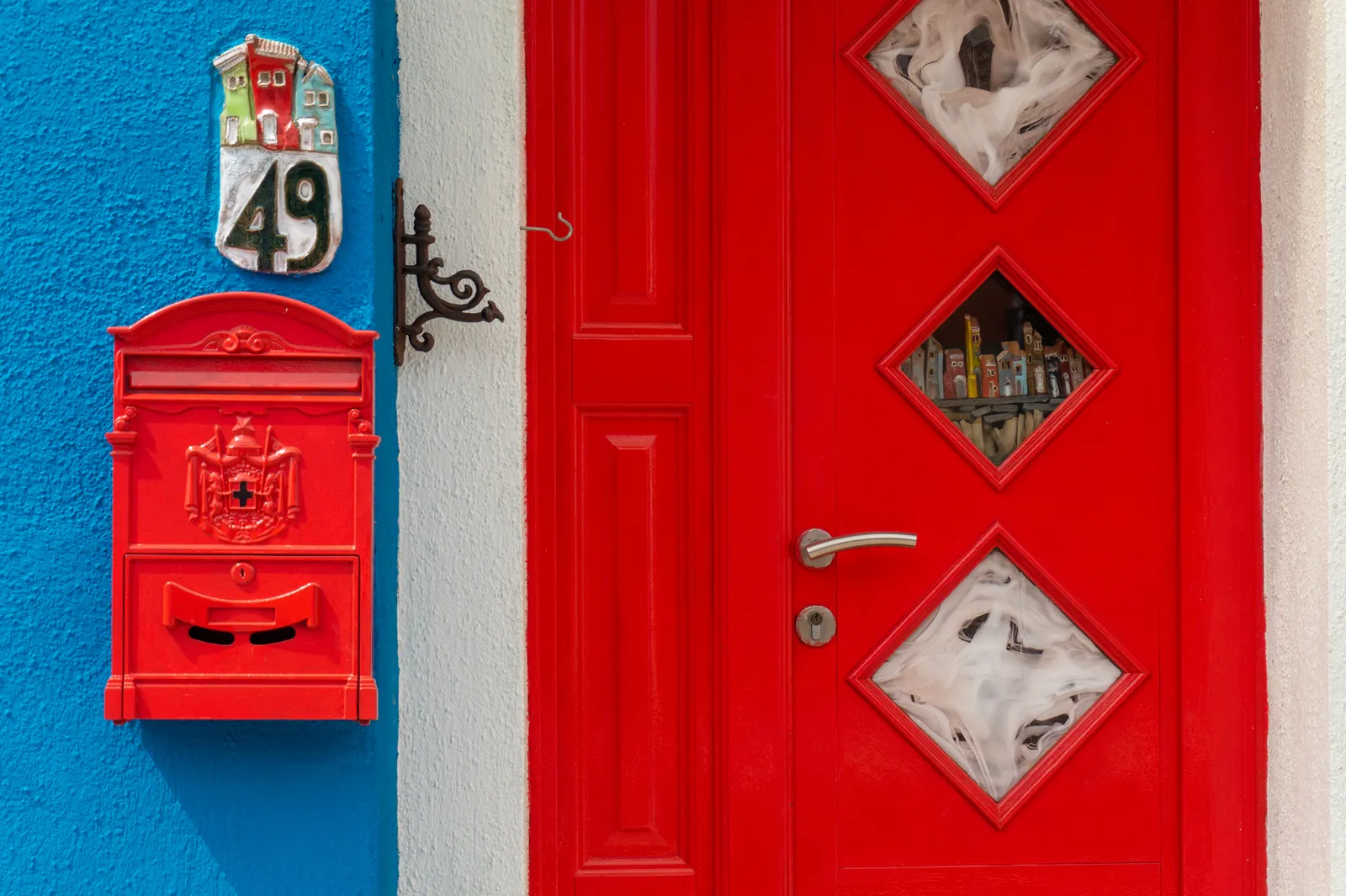
Throughout history and across different parts of the world, front door colors have held deeper meanings. These traditions can still influence how your home’s entrance is viewed today.
In early American history, a red front door indicated travelers were welcome to spend the night. Perhaps this is why red is a popular front door color for many Colonial-style homes. In Scottish history, a red door announced that the mortgage had been paid off. These weren’t decorative choices. They were practical signals.
During the Civil War, red doors signaled that a home was a safe space for enslaved people on the Underground Railroad. In Chinese culture and in feng shui, red doors symbolize good luck, prosperity, and positive energy. The front door, painted differently from the rest of the house, has served as a billboard of intent across many cultures and eras.
Feng Shui and the “Mouth of Chi”
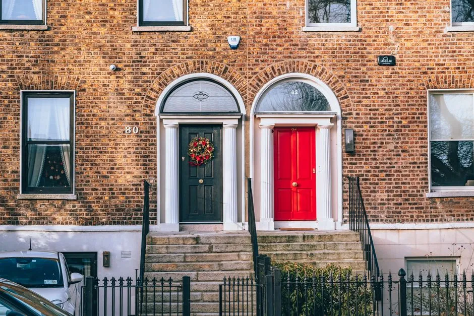
Feng shui literally translates to “wind” and “water.” It is a Chinese philosophy in which the arrangement and color choice of objects in a room relate to the flow of energy, known as Chi. In this philosophy, the front door is considered the mouth of the home, called the “Mouth of Chi.”
In Chinese culture, the color red symbolizes happiness, health, and luck, while the ancient Chinese tradition of feng shui teaches that the front door of the home allows energy, or “chi,” to flow into the house. Blending these two ideas by painting a front door red results in an entrance that welcomes positive energy into the home.
The front door is a critical aspect of a house according to feng shui as it is regarded as the main entry point of energy. Choosing a door color that contrasts with the house isn’t just aesthetics in this tradition. It’s intentional energy management.
Victorian-Era Class Signaling That Still Echoes Today
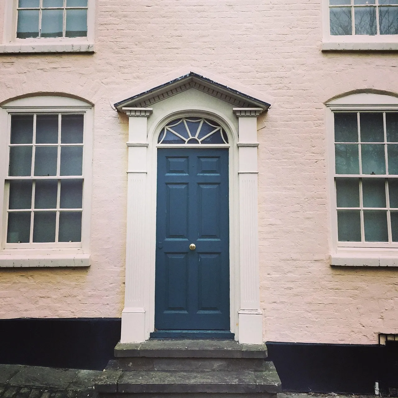
In Victorian times, door colors were not only influenced by trends and availability but also by social standing and personality. The wealthiest households often used colors that were rare or expensive to produce, making the door a subtle marker of status.
During the Victorian era, black was commonly associated with formality and prestige, often chosen by affluent homeowners to project a sense of stability. Rare in Victorian times due to the cost of purple pigments, a purple front door was often seen in homes of the aristocracy.
That class signaling never fully disappeared. Today, homeowners still use color to express individuality and enhance curb appeal. The impulse to distinguish the door from the house is partly a long echo of that Victorian instinct to say something about oneself through the entrance.
The Door Color Signals Personality
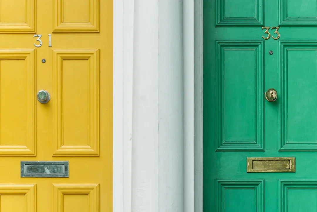
Your front door is more than just an entryway; it’s a statement of your style and a reflection of your personality. Understanding the symbolic meanings of different colors can help you choose a hue that not only enhances your home’s curb appeal but also resonates with your personal taste and cultural significance.
Are you bold and adventurous, or calm and collected? Believe it or not, your front door color might be revealing more about your personality than you think. A yellow door suggests something quite different from a charcoal one, and people read those signals whether they consciously intend to or not.
In keeping with other color trends for 2025, designers are predicting that shades reflecting personalities, or at least homes’ architectural styles, will reign for front doors. The contrast between door and house makes that personality signal legible. A matching door would blur the message entirely.
Real Estate Value Is Quietly Tied to Door Color
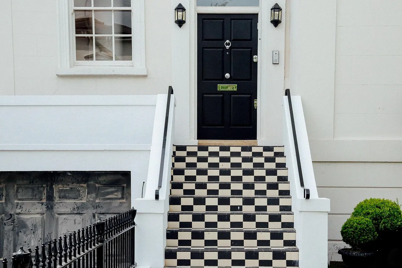
Zillow research indicates a black front door is associated with the highest resale price compared to other front door colors like red and blue. This shade could boost an offer price by about $6,450 more than the typical U.S. home value.
Entry doors are the focal point of curb appeal and the first element buyers react to in listing photos. Door color and style correlate with measurable differences in offer prices. That correlation is part of why homeowners instinctively choose a contrasting door: they sense, correctly, that it reads as more intentional and polished.
Fresh exterior paint enhances curb appeal, and buyers make judgments about your home within seconds of seeing it from the street. First impressions matter enormously in real estate. A door that blends into the facade simply doesn’t create the kind of impression that drives faster sales or higher offers.
The Design Logic of Contrast and Composition
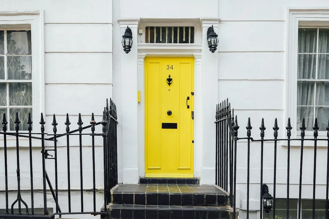
A good place to start when choosing a door color is to look at the overall style of your house. Go with a color that will complement the overall architecture and consider the colors of the windows and other elements of your home.
Craftsman and cottage-style homes often look great with natural or earthy entry doors, such as wood-stained brown or soft greens. Your front door color should stand out without clashing with the homes around you. This is the design principle in action: contrast, not clash.
Dark finishes are increasingly popular for their versatility across neutral and dark-accented homes. Customization continues to trend as homeowners display their personal style. The contrasting door has become the most accessible, lowest-cost way to bring genuine personality to an otherwise standard exterior.
What the Trending Colors of 2025 and 2026 Tell Us
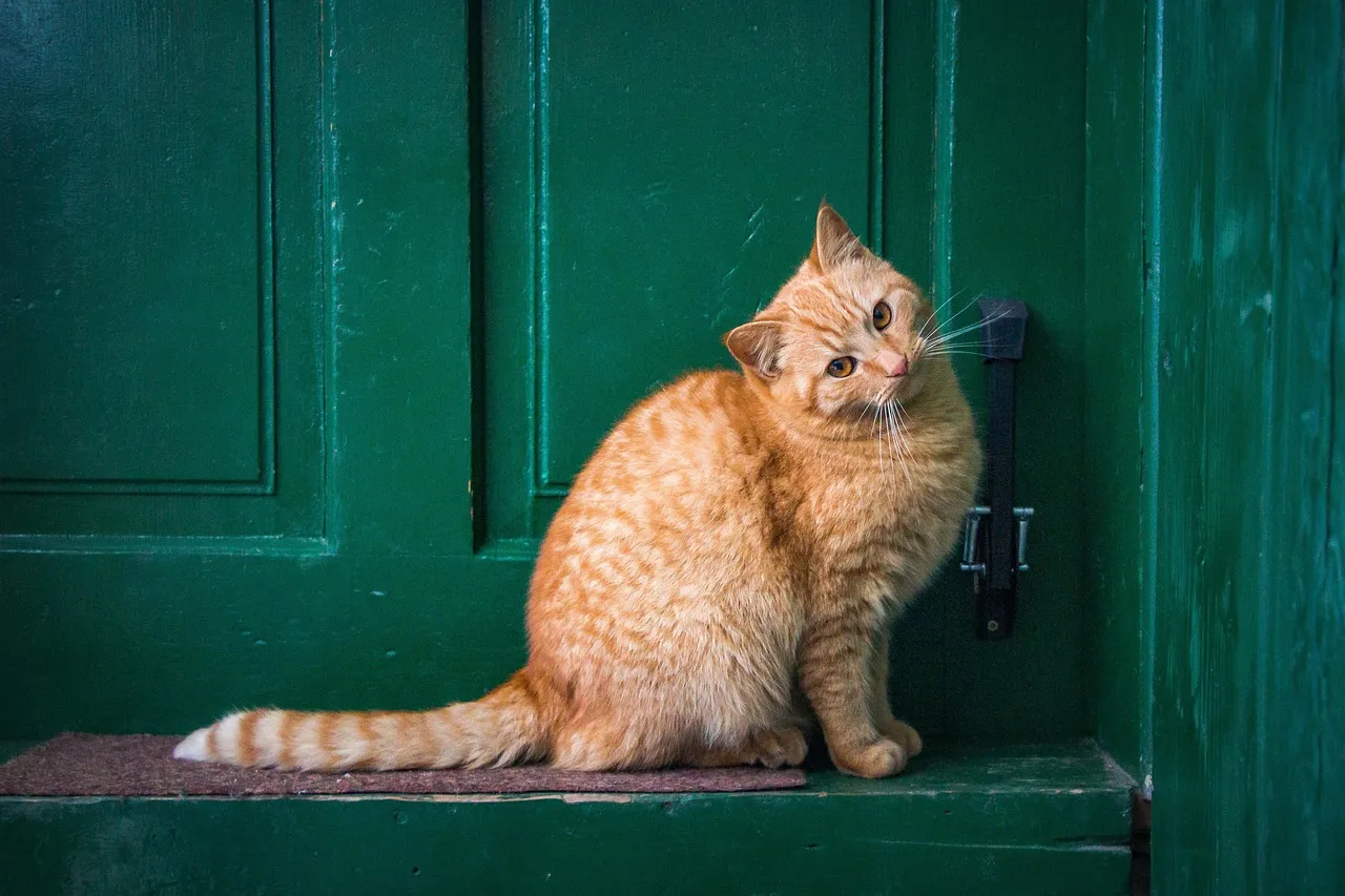
The most notable front door trends of 2025 include bold-colored, beautiful entry doors, wider entry spaces, and custom hardware that accents individual homeowner preferences. The direction of that trend is clearly toward more contrast, not less.
Designers polled for the 2025 front door color trends reported some surprising insights. Most notably, the color green, in all its shades and saturations, was far and away their top pick for front doors. Green remains a favorite in 2025, with earthy and muted shades leading the way. Benjamin Moore’s “Lafayette Green,” a deep, stately green, creates a timeless and sophisticated entrance. These darker greens pair well with wood, stone, or neutral-colored siding.
Black doors are synonymous with elegance and sophistication. In 2024, matte black finishes are particularly on-trend, offering a chic, modern look that stands out while maintaining a classic appeal. Both green and black work precisely because they contrast clearly against the typical exterior palette of greys, whites, and beiges.
The Threshold as a Symbolic Space
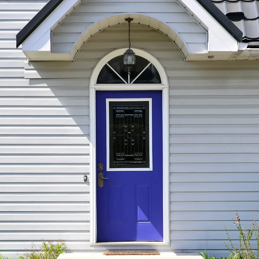
Walking through the front door is a ceremonial moment. This idea is older than modern design theory. Across many cultures and belief systems, the entrance to a home has been treated as a liminal space, a boundary between the private and public worlds.
Blue doors have historically represented safety, peace, and faith. It was thought that having blue doors would endow the family that resided in the home with blessings and good luck. Marking that threshold with a distinct color reinforces its symbolic weight. It says: something changes here.
A period front door is more than just an entryway – it’s a statement. That statement only lands when the door looks different from everything else around it. A door that disappears into the facade can’t carry meaning. It takes contrast to make something say something.
Final Thoughts
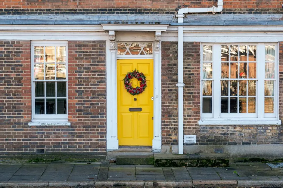
The contrasting front door isn’t a trend or an accident of taste. It’s the convergence of psychology, cultural history, real estate practicality, and a basic principle of visual design: meaningful things need to stand out.
From a Scottish homeowner painting their door red to announce a paid mortgage, to a Victorian aristocrat signaling status through a costly pigment, to a 2026 homeowner picking a deep sage green to boost their listing price, the instinct has remained constant across centuries.
The front door is where identity meets architecture. Painting it a different color from the house isn’t decoration. It’s a declaration. And that, more than anything, is why it’s almost always done.
AI Disclaimer: This article was created with the assistance of AI tools and reviewed by a human editor.