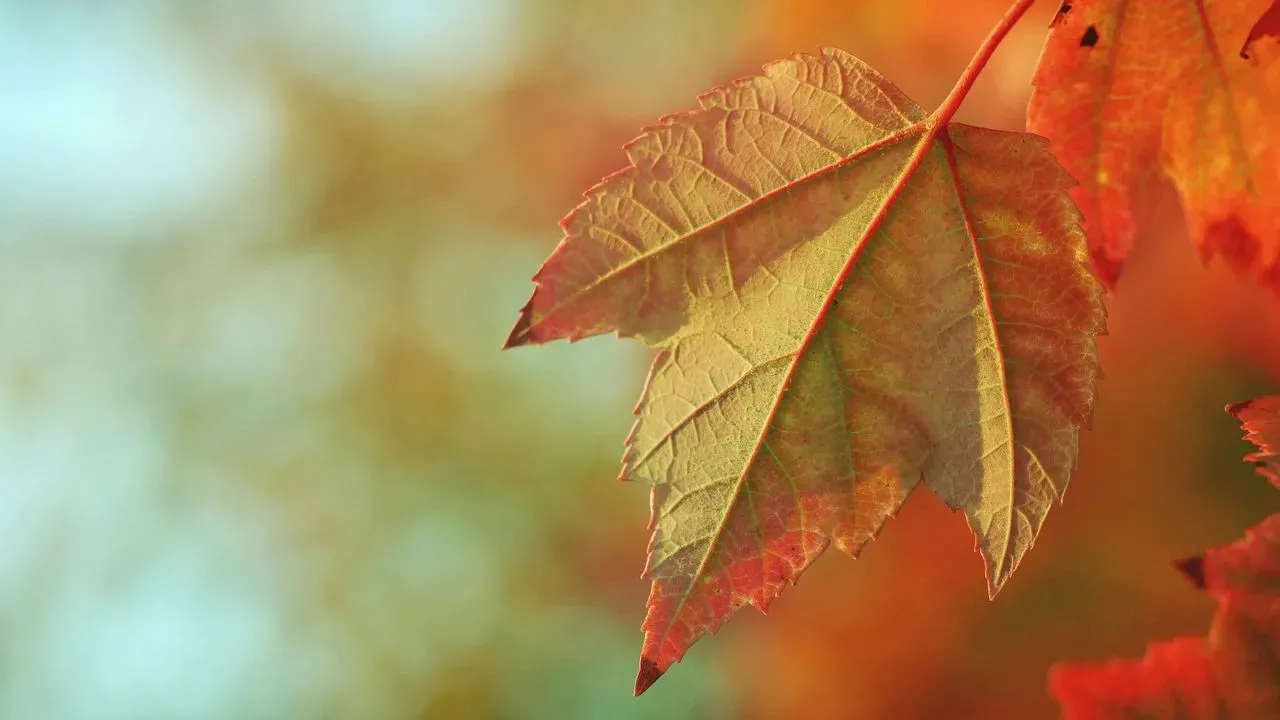

As autumn arrives and gardens shift into layers of muted gold, deep olive, and warm rust, many people notice the same earthy tones appearing in their closets. The seasonal change outdoors often sparks a desire to align personal style with those natural hues. This approach, known as autumn color analysis, helps identify shades that enhance skin, eyes, and overall presence without relying on simple markers like skin tone alone. ([1])
Reading the Season Through Natural Features
Autumn palettes draw from the grounded warmth seen in fall landscapes. These colors sit in a medium to deep range, with undertones that lean warm rather than cool. Temperature, value, and chroma all play a role when determining harmony. Professionals assess how colors interact with hair, eyes, and skin together instead of isolating one trait. Common misconceptions arise from quick tests like checking vein color or assuming olive skin signals warmth. A full reading considers the complete picture. Fair complexions can belong to autumn just as readily as deeper ones, provided the overall qualities align.
Simple Draping to Explore Your Fit
At-home experiments offer a starting point for many. Hold fabrics like olive green, warm chocolate brown, or soft beige near the face in indirect daylight. Observe whether the shade brings eyes and smile forward or leaves the complexion looking uneven. Pure black, stark white, or neon tones often create contrast that feels off. Removing makeup, avoiding direct sun, and referencing natural hair color improve accuracy. Results point toward possibilities but benefit from professional confirmation for precision.
Three Distinct Autumn Variations
Within the broader autumn family, three sub-seasons stand out. Soft Autumn emphasizes muted qualities first, with low to medium contrast and gentle depth. Colors appear understated, favoring oatmeal neutrals and sage accents over anything vivid. True or Warm Autumn leads with temperature. Medium contrast and rich but never neon shades define it, including camel, rust, and warm teal. Dark or Deep Autumn prioritizes depth, showing medium-high contrast and stronger saturation in espresso, forest green, and oxblood. Each variation appears across many skin tones and hair colors. The shared thread remains warmth paired with the right level of softness or intensity.
Integrating Palette Colors Gradually
No one needs to overhaul an entire wardrobe upon discovery. Focus first on pieces worn closest to the face, such as tops, scarves, and makeup. Borrow selectively from neighboring palettes when needed, yet return most often to the dominant qualities of your own sub-season. Texture matters as much as hue. Suede, linen, and matte finishes reinforce the grounded feel. Metals in brushed gold or antique bronze tend to harmonize better than high-shine options. The goal stays simple: colors that make dressing feel natural rather than forced. Color analysis serves as a practical guide rather than a strict rulebook. Start with shades that already appeal, test them near the face, and notice the difference in how features come forward. Over time, the right autumn tones turn everyday choices into something that feels quietly aligned with the season itself.
AI Disclaimer: This article was created with the assistance of AI tools and reviewed by a human editor.