

Going Too Dark on Every Wall
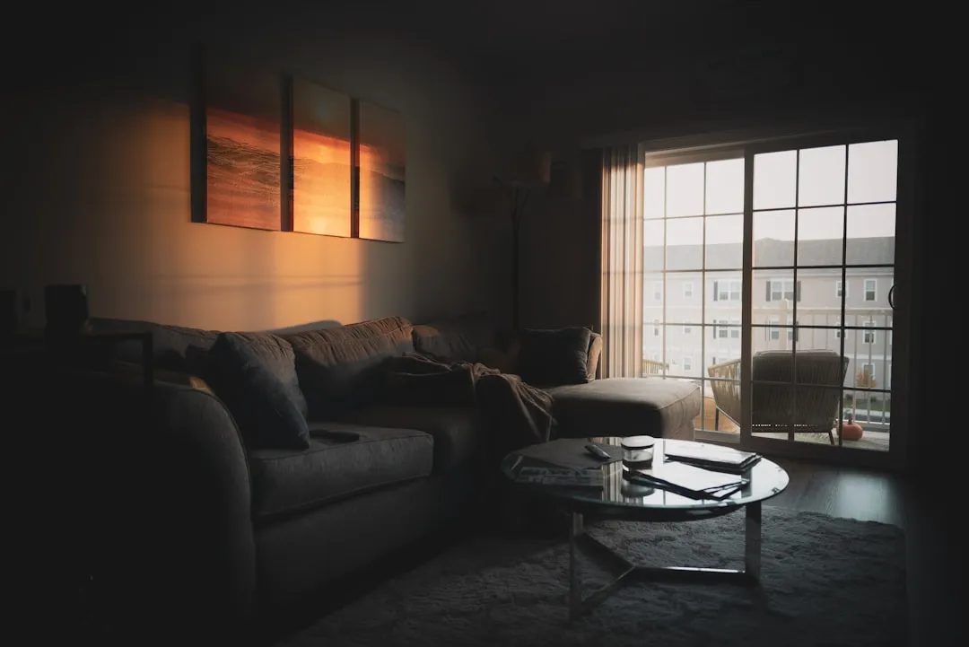
Dark colors can add depth and drama, but using them excessively or in the wrong places can close in a room. When dark paint covers every wall in a smaller space, it absorbs light, making the area feel confined. The physics here are straightforward. Less reflected light means less visible depth, and a room starts to feel like a box.
When light hits a dark wall, less of that light is reflected back into the room. As a result, the room can appear dimmer and more confined. This effect is especially noticeable in spaces with limited windows or poor lighting. A large, well-lit room may absorb a moody navy beautifully. A compact bedroom with one north-facing window almost certainly won’t.
The Science Behind Bright Walls and Perceived Space

Architects assume that the luminance of the bounding surfaces, meaning the walls that constitute the respective judged spatial dimension, as well as the luminance of the surrounding surfaces, are of importance when adjusting the perceived layout of a given room. With regard to the bounding surfaces, bright paint makes surfaces appear farther away compared to dark paint, and thus increases the perceived extent of the respective room dimension.
Previous studies have reported that bright ceilings appear higher than dark ceilings, irrespective of the other colorimetric properties of the ceiling color such as hue and saturation, and irrespective of the luminance of the remaining room surfaces. This research, published in peer-reviewed literature from Johannes Gutenberg-Universität Mainz, confirms what designers have long argued: brightness itself, not just color choice, drives how large a room feels.
Ignoring the Ceiling: The Fifth Wall Problem

Homeowners often forget about the “fifth wall,” which is the ceiling. Leaving your ceiling plain white, or worse, painting it a darker color, can make a room feel boxed in. Opting for a lighter shade of your wall color or a soft, neutral tone gives the illusion of height and airiness.
Ceilings are often an afterthought, if they get any attention at all. The ceiling paint color has a greater impact on the room’s appearance than many realize; it helps influence the perceived height and warmth of a room. The 2026 interior paint landscape has responded to this directly, with color-drenched rooms that match walls and ceilings as a deliberate spatial trick gaining significant traction among designers.
Overly Contrasting Walls and Trim

Bold, contrasting colors on walls, ceilings, and trim can chop up your space visually. Instead of creating flow, this jarring combination can make rooms feel disjointed and smaller. The eye keeps stopping, finding hard edges instead of gliding through the room naturally.
High-contrast mistakes include dark walls paired with bright white trim or a bold wall color against a stark white ceiling. This creates hard visual stops that chop the room up. In a smaller room, those visual interruptions pile up fast. Using overly contrasting wall and trim colors breaks up the space visually, and ignoring how lighting affects undertones throughout the day compounds the problem.
Choosing Colors With the Wrong Undertone

Undertones are the silent operators of paint color. A gray that looks crisp and cool in the store can turn lavender or greenish on your walls once it reacts with existing light conditions, flooring tones, and furniture. North light is steady and cool, and a blue-gray placed in it can turn into something closer to the color of a February parking lot.
One common mistake is choosing paint that is too dark or too bold for a small room. Another is using too many contrasting colors on walls, trim, and ceiling. Dark floors paired with dark walls can also make a room feel heavy. Undertone clashes between the floor and wall are a particular trap, since the eye registers the conflict even if the homeowner can’t immediately name it.
Saturated Colors in Low-Light Rooms
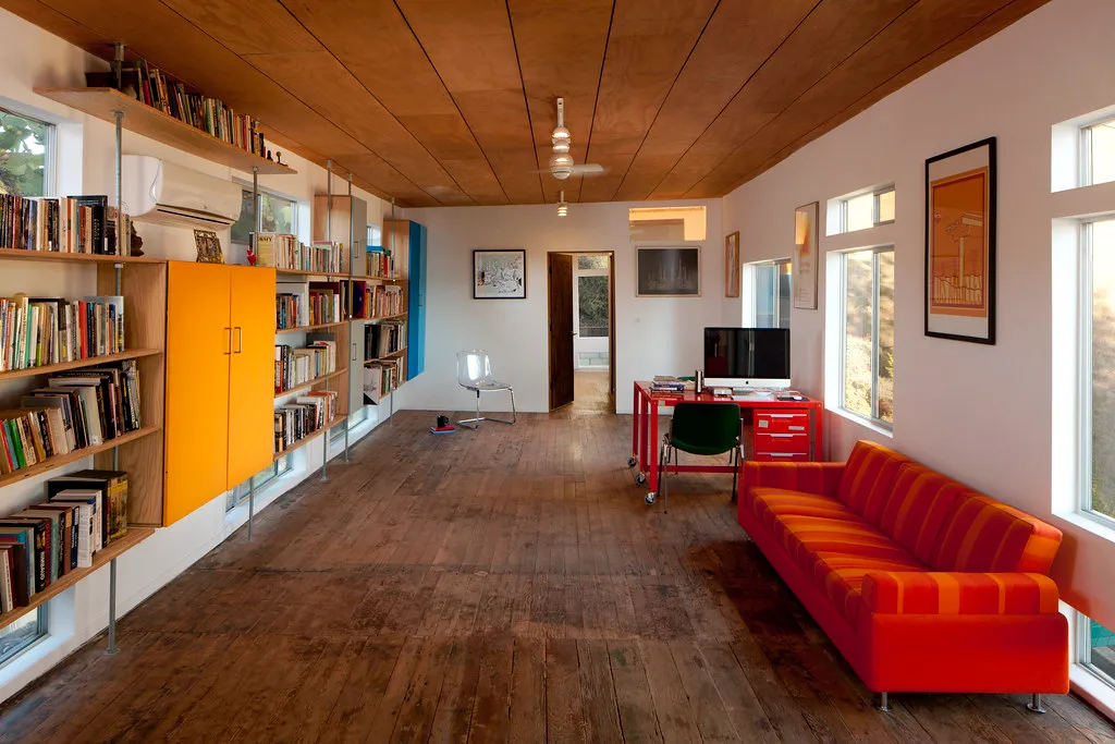
Bright and bold colors can be fun, but in small rooms, they can overwhelm the senses. Neutrals and soft pastels make rooms feel more open by reflecting light and reducing visual competition. A saturated color demands attention, and in a tight room, that demand becomes claustrophobic.
In rooms with less square footage, light hues help to bounce around natural and artificial light and create an illusion of open spacing. Light blues, grays, and greens can make walls seem further away, while warm colors and deeper hues reduce the visual footprint. That’s not a reason to avoid bold colors entirely, but it is a reason to understand what they’re doing before committing to a full room application.
The Accent Wall That Backfires
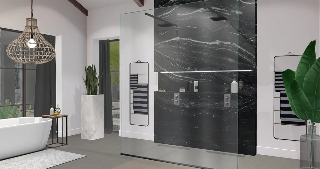
The accent wall became so popular for so long that it started being applied everywhere, including spaces where it genuinely doesn’t help. A single dramatically dark wall in a small living room doesn’t add depth so much as it removes it. What quietly works against a room includes dark ceilings, chopped-up sightlines, muddy undertones, overworked accent walls, and saturated shades asked to survive on almost no daylight.
In a large room, the trick isn’t making everything pale. It’s preserving depth, continuity, and enough contrast to see the architecture without outlining every inch of it. Accent walls can work beautifully in rooms with strong light and generous proportions. In compact spaces, they usually just make one wall feel even closer.
Painting the Trim the Wrong Shade

Trim has the aesthetic function of enhancing or changing the perception of a room’s size and shape. By using trim to create strong lines, you can make a room seem larger, or by breaking up soaring walls, you can make it seem cozier. Most homeowners don’t think of trim as a spatial tool, but professionals do.
Dark trim doesn’t automatically shrink a space, but it can if misused. In smaller, dimly lit rooms, deep trim tones can feel heavy and enclose the space. The key is contrast: pairing dark trim with the right wall and ceiling colors creates depth rather than clutter. Homes with higher ceilings can handle darker trims easily, while low-ceiling rooms may benefit from medium-tone trims to avoid feeling boxed in.
Forgetting That Finish Matters as Much as Color

While glossy finishes reflect light and can brighten a space, using them on walls can highlight imperfections and create an overwhelming effect, particularly in smaller rooms. Matte or eggshell finishes can be much more forgiving, offering a smoother, more expansive appearance. Finish is one of the most overlooked variables in residential painting, and it’s one of the easiest to get wrong.
A few very common color mistakes can quietly shrink a space, lower perceived home value, and make a room feel darker or tighter than it actually is. Finish interacts with all of them. A flat or matte finish on a pale color can make even a bright shade feel absorbed and lifeless. An eggshell or satin on the same shade activates the reflection just enough to push the walls back visually.
Not Testing the Color Before Committing

The right paint color can change the impression of a space, help it reflect light, and create an airy, expansive feel even when the square footage stays the same. The wrong one, chosen too quickly and applied to all four walls without sampling, can do the exact opposite within a weekend.
Always test using sample pots, and test at various times and positions, under both daylight and artificial light. A color that looks warm and creamy at noon can shift cool and institutional by lamp light. Poor lighting can also make paint colors look different than expected, which means the chip on the store card is genuinely not enough information to make a confident decision.
The Takeaway

None of this is about avoiding bold choices or defaulting to safe, beige minimalism. The actual mistake is applying any color, dark or light, without understanding how light, finish, undertone, and contrast interact in that specific room at that specific time of day.
The right paint color can change the impression of a space, help it reflect light, and create an airy, expansive feel even when the square footage stays the same. Getting there just takes a little more thought before picking up the roller. Sample first, observe under different light conditions, consider the ceiling and trim as part of the equation, and the room you wanted is usually closer than you think.
AI Disclaimer: This article was created with the assistance of AI tools and reviewed by a human editor.