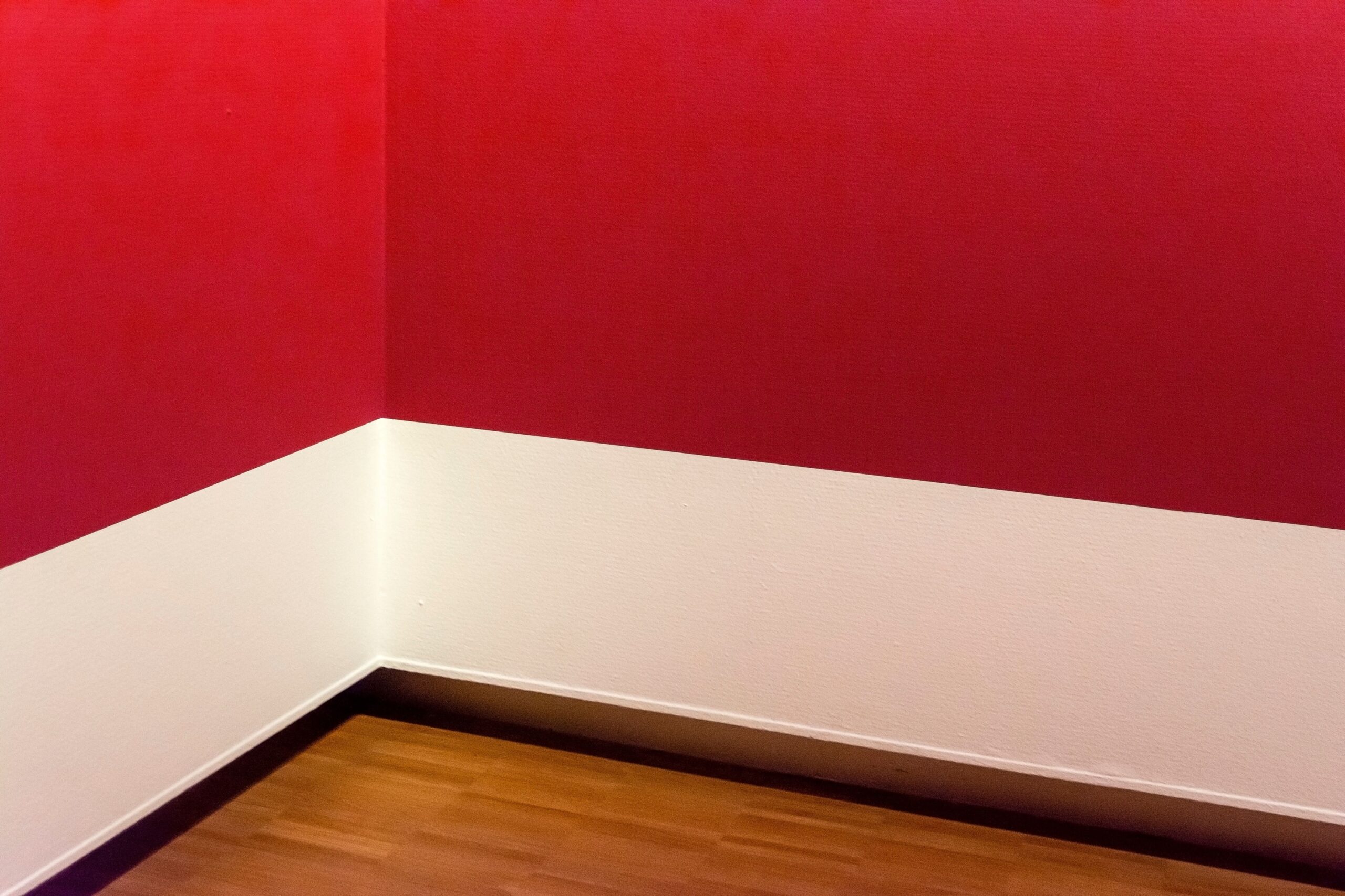

Red: The One Color Sleep Experts Consistently Flag
Red may be the worst color to paint your bedroom. It is a warm color and has the longest wavelength of any color on the visible light spectrum. That long wavelength isn’t a minor technical detail. Cool colors with shorter wavelengths tend to slow heart rate and create peaceful feelings, while warm colors with longer wavelengths can increase alertness and energy.
People often associate red with fear, anger, and excitement, as well as stressful words such as “panic,” “injury,” and “pain.” This isn’t just anecdotal. Research has found that viewing the color red may promote aggression and increase blood pressure and pulse rate.
What the Survey Data Actually Shows
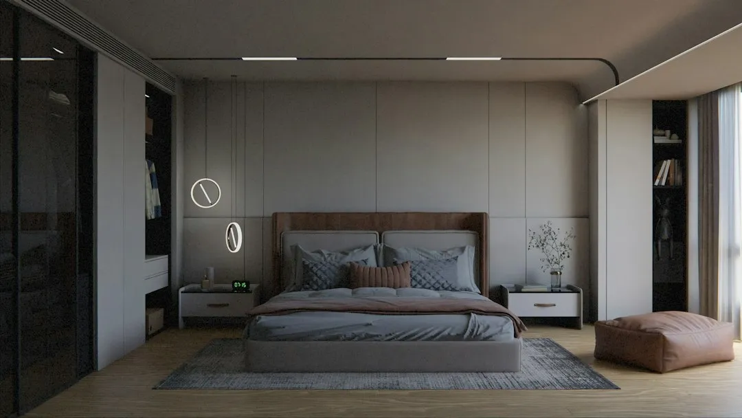
According to the Sleep Foundation and a Travelodge study of 2,000 households, bedroom wall color is one of the largest non-mattress factors influencing perceived sleep quality. Cool blue, soft green, and pale lavender bedrooms averaged nearly eight hours of sleep per night, versus roughly five and a half hours for saturated red bedrooms. That gap is substantial by any measure.
Travelodge’s study on 2,000 residents of different ages found that blue bedrooms were the most conducive to sleep among all colors, followed by yellow and green. Meanwhile, red was found to be overly stimulating to the brain, whereas white was too bright and tended to remind people of a work environment, reducing the ease of falling asleep.
The Science Behind Why Red Keeps You Awake
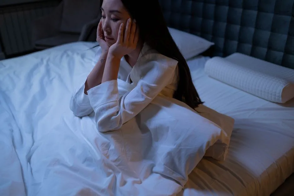
Colors reflect wavelengths of light into your eyes that affect your biorhythms, including the circadian rhythm and diurnal rhythm, and your body clock. Red walls don’t just look bold. This bold shade makes your heart rate and blood pressure rise, creating conditions that fight against sleep. Research shows red increases brain activity and keeps you alert, which is the opposite of what you need before bed.
Psychologists have found that energy levels and mood are both affected by the colors surrounding us. Colors with long wavelengths, such as red and yellow, tend to be more stimulating, potentially disrupting your ability to wind down when you need it most.
Red vs. Blue: A Telling Comparison
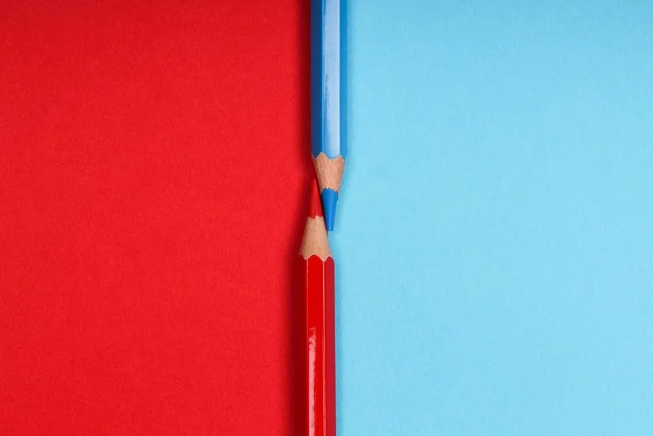
In an experiment on color psychology conducted by the University of Basel in Switzerland, researchers observed 300 insomnia-prone individuals living in bedrooms painted blue, green, yellow, and red. The results showed that blue was more helpful in prolonging sleep time, with an average sleep duration of 7.1 hours, and a 10-minute reduction in average time taken to fall asleep compared to the red group.
The brain is more perceptive to the color blue than any other color, thanks to special receptors called ganglion cells located in the retinas. Ganglion cells collect information from visual surroundings and turn this information into chemical signals to the hypothalamus, a part of the brain responsible for producing hormones like melatonin and cortisol. The contrast with red’s stimulating effect is sharp.
How Red Affects the Room Itself
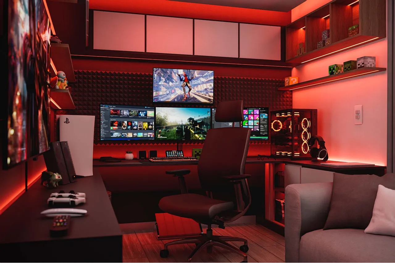
People find red rooms stimulating, and they perceive them to be smaller than rooms of the same size painted with cooler colors. That sense of spatial compression adds another layer of psychological tension. The high saturation of red absorbs and reflects light in a way that can make a bedroom feel unnecessarily cramped and smaller than it actually is.
A bedroom that feels tight and charged is the opposite of a restful refuge. The visual energy that red generates doesn’t simply disappear when you close your eyes.
Bright Yellow and Orange Are Close Runners-Up
While yellow has been a trending color, not every shade of the color is well suited for a restful space. Vibrant yellow hues channel an intense energy, stimulating the brain and preventing you from falling asleep easily. Bright yellow and orange, while cheerful, can also be overstimulating for bedtime.
Bright red, neon orange, and vivid yellow are stimulating colors that interfere with your sleep cycle. These shades might work perfectly in a kitchen or living room, but they have no business being the dominant note in a space built for rest.
The Emotional Connection Between Color and Sleep Onset
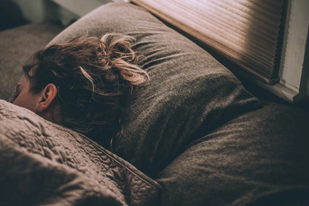
Your emotional state before bedtime significantly affects your sleep quality. Studies show that poor mood can negatively impact how well you rest. Color is a quiet but persistent mood driver. Scientific studies have shown that certain colors can trigger physiological and psychological responses. Understanding the connection between color and emotion comes from an area of study called color psychology, which focuses on how color affects our daily lives.
In addition to the temperature of the room, noise, and exposure to light, color can play a huge factor in sleep patterns. Red stacks against you on all of these fronts simultaneously, raising heart rate, provoking alertness, and generating emotional unease.
What Happens When You Add High Saturation to Any Color

The worst colors for sleep are likely those that are both stimulating and provoke negative emotions, since this may prevent relaxation. In general, people tend to find warm colors with long wavelengths, such as red and yellow, the most stimulating. Saturation matters too. A deep, highly saturated red is worse than a dusty rose, even if both lean warm.
Even darker shades like black or deep brown may feel heavy or confining, which is not ideal for a calm sleep environment. The common thread is that any color pushing toward visual intensity, whether through brightness or saturation, tends to work against sleep.
What the Design World Is Recommending in 2026
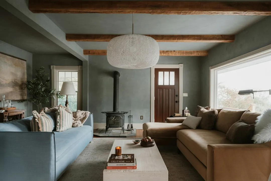
The 2026 shift in interior design is moving away from all-white minimalist bedrooms toward warmer, more textured spaces. Botanical greens and warm earth tones are replacing the stark white-and-grey palettes that dominated from 2018 to 2024. The most popular 2026 palettes are warm neutrals, sage greens, dusky blues, and clay terracotta tones.
Red, bright orange, and electric yellow stimulate the nervous system. These work as accent colors in small doses, such as a throw pillow or a piece of art, but should not dominate the room. That’s a practical middle ground for anyone who genuinely loves bold color.
So What Should You Paint Your Bedroom Instead?
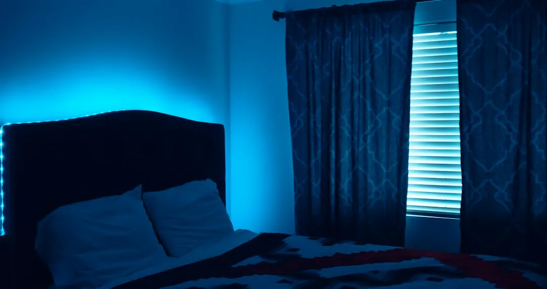
Studies of color and language have found that blue is strongly linked to words such as “relaxed,” “safe,” “satisfied,” and “secure.” Some research even suggests that the color blue can reduce heart rate and blood pressure. One survey found that people with blue bedrooms had the longest average sleep per night, compared to people with different colored bedrooms.
Research shows that soft blues, greens, and neutrals like beige or gray are among the best colors for sleep because they reduce stress and promote relaxation. A good rule of thumb is to stick with neutral or pastel shades for a soft, welcoming atmosphere. Cooler and more neutral tones are less visually stimulating, making them more restful to the body and mind.
The Takeaway
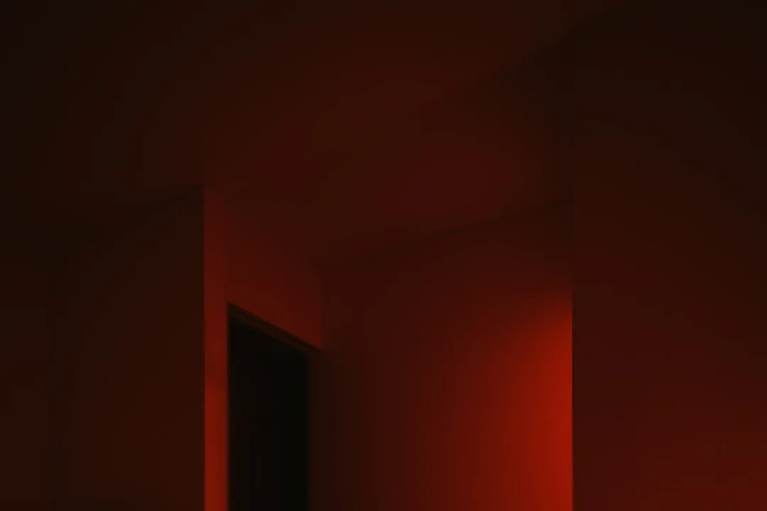
Your bedroom walls are not passive background noise. They are doing something to your nervous system every single night, either helping it settle or quietly fighting against the process. Your sleep, your mood, and even how quickly you drift off can all be influenced by the color of your bedroom walls.
Red, in particular, earns its reputation as the color to avoid. The data on sleep duration, the physiology of wavelength stimulation, and the emotional associations all point in the same direction. If you are staring at a red wall each night and wondering why sleep feels just out of reach, you may already have your answer.
AI Disclaimer: This article was created with the assistance of AI tools and reviewed by a human editor.