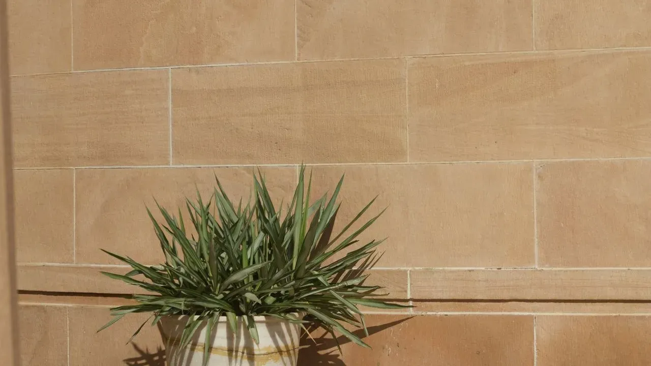

Paint brands have long pushed seasonal shades, yet many homeowners have stuck with safe white walls for years. That pattern appears ready to shift as multiple companies unveil their 2027 color selections, favoring earthy greens and grounded neutrals instead. The move reflects a broader desire for interiors that feel more connected to the natural world. ([1])
Earthy Tones Signal a Clear Change
Several major brands have landed on similar palettes this cycle. Sherwin-Williams selected a pale herbal green called Celery, while Behr chose a mossy olive named Grounded. Valspar and Glidden both leaned toward soft, smoky blues with names like Cottage Door and Artifact. These choices avoid bright or high-energy hues in favor of colors that evoke soil, plants, and calm outdoor settings.
The consistency across announcements stands out. Three of the picks reference the ground or roots directly, and two greens appear among the top selections. Designers note that such tones create layered spaces with more warmth than the all-white rooms popular several years ago. The result feels less like a bold statement and more like a quiet return to nature-inspired living.
Designers Confirm the Trend in Real Projects
Chicago interior designer Kristen Ekeland reports that clients now request earth tones, rich olive, and sage greens for their homes. She describes a move away from uniform white interiors toward palettes that feel rooted and restorative. Ekeland sees these shades already appearing in client work, paired with botanical prints and natural materials.
Other professionals echo the same direction. Many view certain greens as versatile neutrals that layer easily with wood, stone, and fabric. The approach brings garden elements indoors without requiring a full overhaul, offering a practical way to refresh spaces while maintaining a grounded atmosphere.
Low-Risk Ways to Test the New Shades
Full-room commitments can feel daunting, so designers suggest starting small. Paint trim, molding, or cabinetry in a soft sage first, then keep walls in a warm white for contrast. Sample boards viewed in different lighting help reveal how deeper olives or smoky blues shift throughout the day.
Pairing remains a favorite tactic. One current project uses a steel blue on walls alongside marble in deep aubergine and oxblood tones for a powder room. The combination creates contrast while staying familiar and calming. Similar pairings with dusty clay or sharp green accents add personality without overwhelming a space.
Why the Shift Matters for Everyday Homes
Many homeowners still default to white, gray, or beige when preparing to sell, yet recent reports show growing interest in designing for personal comfort rather than resale appeal. Earthy greens and related tones support that shift by fostering a sense of ease and connection to the outdoors. The financial angle also appears in some analyses, with certain green walls linked to stronger buyer interest.
These forecasts serve best as inspiration rather than strict rules. Brands continue to release additional colors, and individual preferences will always vary. The common thread remains a preference for colors that feel settled and personal, much like elements drawn from a garden setting.
AI Disclaimer: This article was created with the assistance of AI tools and reviewed by a human editor.